How can I identify key performance feedback?
Based on our experience, when the survey results contain more than three or four ways to segment feedback pertaining to performance, you need to determine the performance aspects that are most important. Without taking this step, the survey result analysis will end up lacking focus and potentially distract or hamper the decision making process.
An Example Scenario
For example, you may have information about the following performance related metrics:
- the level at which individual needs are met
- the level of individual productivity
- the level at which team needs are met
- the level of team productivity
- the level at which equipment needs are met
- the level at which training needs are met
- the level at which the workforce feels engaged
Obviously all of these issues are important, however, it is overwhelming to review all of these multivariate analyses during a meeting. If you have additional metrics (department, locations, etc.) to further layer on top of these then the process and presentation of the results becomes exponentially harder.
We built just the right tool to alleviate this situation. It goes in the following two steps.
Create balanced result segments
For each metric, create three to four non-overlapping segments. For multiple choice, ratings and AnswerCloud questions, a segment may be just one of the options or be a combination of a couple or a few options. For example, for an age question with seven age ranges that span from 18–75, the three segments you end up with could be: “18–34”, “35–54”, and “55+”.
Ideally, there should be as even a distribution of responses among the segments as possible. You may have to try a few different combinations before arriving at the most appropriate segments.
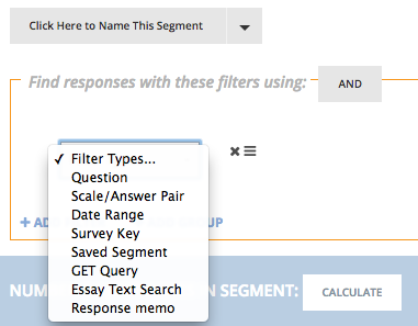
Use the “Calculate” button in the segment UI (see figure above) to help with trial-and-error experimentation. Clicking on “Calculate” reveals how many responses are in the segment that you are creating. If the count is too high or too low, adjust options and then click “Calculate” again. Save the segment after you are done. This step is largely manual. A frequent user can create about 20 segments in 10 minutes. Another method is by using Survature’s crosstab to generate segments. Some users use this as a quick method for identifying key segments within results.
Find the keystone in the survey results
Test for statistical correlation using crosstab. Just pick any two dimensions to check for their statistical correlation in the crosstab. For example, “how well are the needs met” vs. “the level of productivity”.
You can see the statistical correlation contained in the crosstab by hovering over the asterisk above the question selector. The following is a screen capture of the crosstab featured in the Tennessee Theatre case study.
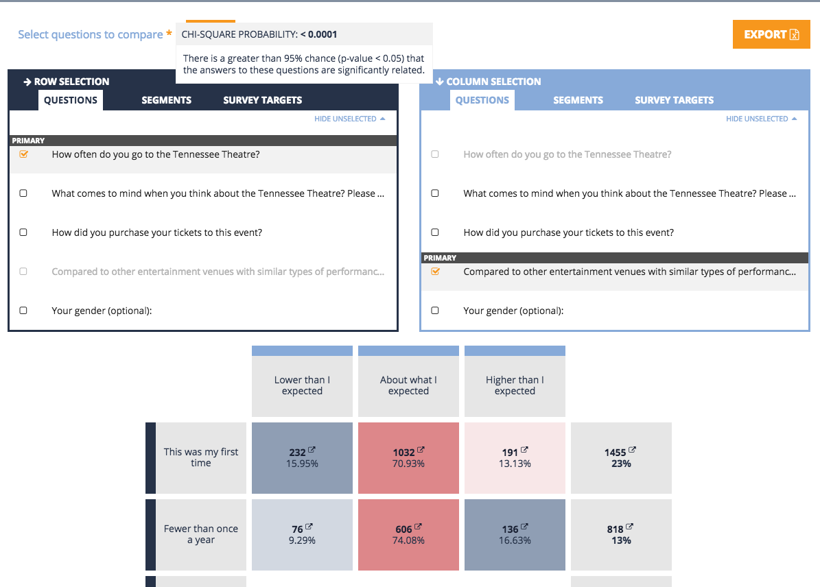
When hovering over the asterisk, the text reports: “There is a greater than 95% chance (p-value < 0.05) that the answers to these questions are significantly related”. This test results confirms that the two dimensions are so correlated that you can treat those as the same in subsequent analysis steps.
If the test reports “There is less than 95% chance…”, then the crosstab does not show strong statistical correlation. In subsequent analysis, the two dimensions have to be treated as different.
By experimenting different crosstabs and checking for statistical correlation among the many potential performance metrics, a potential outcome for the scenario above may be that many of those listed metrics are significantly related to “Team productivity”.
If that’s the case, those related performance metrics do not need to be analyzed further. “Team productivity” is the keystone. Just analyzing along that dimension is significant enough to provide focus to the presentation of the findings.
The outcome of this two-step process helps simplify the interactive exploration of results and form the basis for exporting Survature’s unique Action Priority Grids that serve to summarize findings.