How can I use crosstab to analyze results?
Crosstab is a very powerful tool for doing survey analysis. It allows you to easily slice-and-dice your survey results and discover meaningful segments of your target audience.
Using the Crosstab
The quickest way to start exploring your data with Crosstab is to select a Row Question and Column Question from the two selection areas and then click the View button.
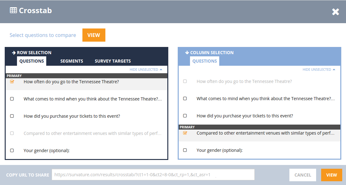
What will then appear is a table containing survey respondent counts representing all possible answer combinations for the selected Row Question and Column Question. Just make selections in the above example, and click on the orange “VIEW” button.
After a crosstab has been generated, you can export the table you see into a spreadsheet as a pivot table. We have a separate article to for the creation and use of pivot tables.
Residual Analysis and Row Comparisons
The default cell coloring of the table cells represents the statistical significance of that cell as the result of a residual analysis. In other words, the more red a cell’s coloring, the lower that cell’s respondent count is compared to its expected value. Alternately, the more blue a cell’s coloring, the higher that cell’s respondent count is compared to its expected value. This allows you to easily spot significant trends in your data.
Another cell coloring option displays statistical significance of cells across row options. Each row is given a number, and when the difference between cells in the same column is statistically significant, we let you know by coloring those cells and displaying the corresponding significant cells.
In the following example, you can see both the Residual Analysis and Row Comparison coloring for Crosstab.
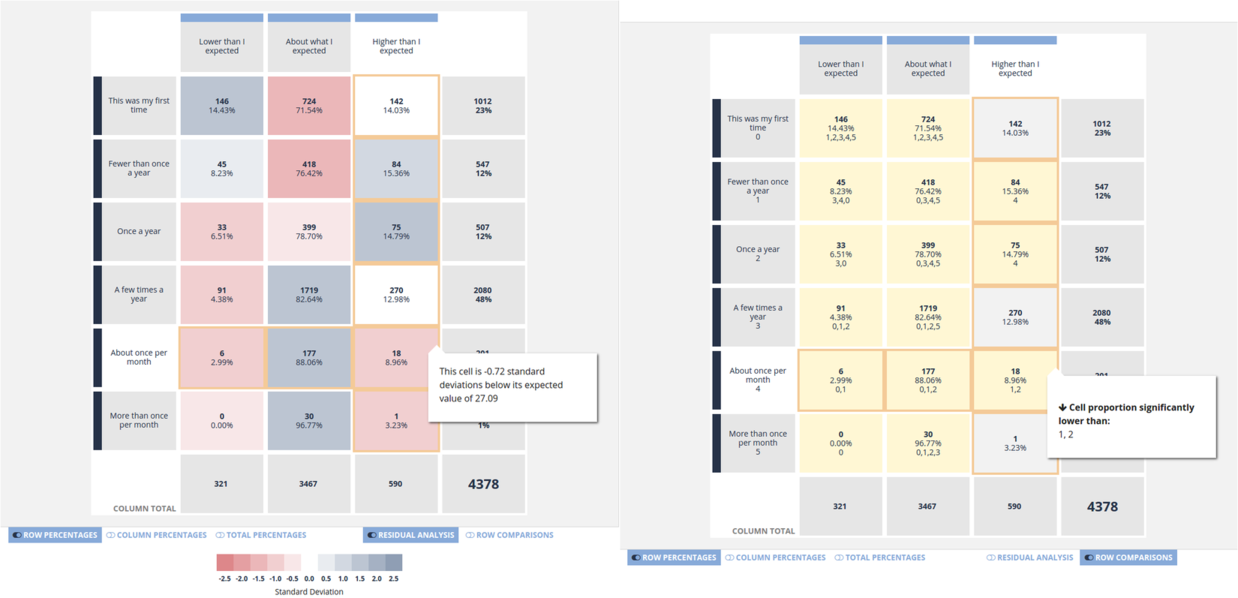
Here we see that the cell corresponding to respondents who answered About once per month and Higher than I expected has a lower than expected count. This means that there is a relationship between patrons who frequent this venue and their view on the price of tickets. We can also see that patrons who answered About once per month are significantly less likely to think the prices are higher than expected versus patrons who answered either Fewer than once a year and Once a year. Using Crosstab, powerful insights such as this are easily discovered.
Crosstab Generated Segmenting
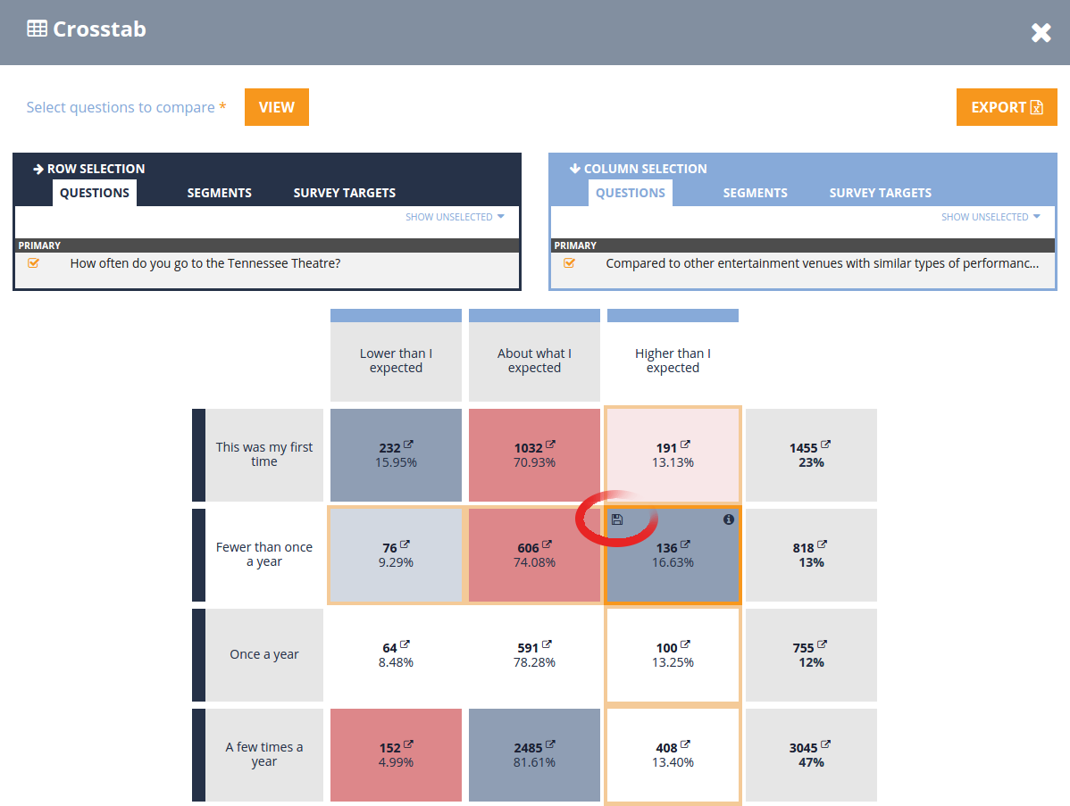
In the Crosstab, hover over a table cell to make the save icon () appear:
Click this icon to bring up the Save Segment dialog:
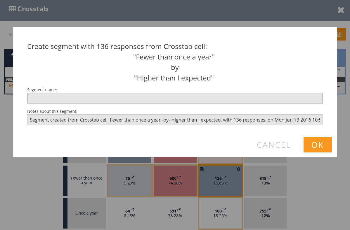
Type in a name for this segment, and click “OK”. Your segment will now be available for viewing from the “Select Segment” dialog the next time you open the results dashboard or refresh the Crosstab page.